Colour in learning spaces has shown to have a significant effect on memory cues and efficiency. The foundational process parts of memory follows: sensory > short-term > long-term
Attention is required when learners process information and select those parts that require further retention.
When we pay attention to certain information, we are selecting and focusing a certain amount of information to be processed in our cognitive system. Colours help learners increase their attention levels on certain information, which help such information be transferred to short-term and long-term memories, thus increasing their chance of memorising such information.
For example, warm colours such as red, orange, and yellow have been recognised as the ideal colours to increase attention and stimulate active participations in activities. Studies stated that the state of being alert physically and internally can enhance short-term and long-term memories.
Colour can help learners improve their learning efficiency, since they are able to process colour automatically without requiring conscious process.
It is reported that colour as a graphical device is used to enhance the organisation and presentation of information, decrease search times, and enable the identification and organisation of information.
Compared with the monochromatic information, application of colour-coded information can better support knowledge retention. Changing the hue can affect recall. For example, using a blue background increases the likelihood that the information delivered will be remembered. Students exposed to a blue background had some reason other than their affective reaction to the colour for having a higher recall of information than respondents exposed to a yellow background.
Some studies have indicated that different colours can affect performances on different types of cognitive tasks. Specifically, red, associated to danger, can activate a prevention focus to remind students to prevent negative outcomes, thus enhancing performance on memory tasks, proof-reading, and tasks requiring attention to detail. Red enhances persuasion. Blue, associated to openness and freedom, can activate a focus for students to achieve positive outcomes.
Emotion & Cognition
Colour affects behaviour as well as cognitive abilities, performance, and intentions. Some scholars regard that colours help learners increase their cognitive stimulation.
Studies indicate that among 10 different hues, yellow hues show higher stimulation and evaluation results than other colours, even though there is not much difference in terms of which colours influence learner attention, or lack there of.
A study conducted by Plass, Heidig, Hayward, Homer, and Um (2014) indicates that warm colours such as yellow and orange rather than cold colours such as grey used in materials can enhance students’ learning.
Positive emotions/moods help learners recall more possible functions for an object from long-term memory. Learners recognise incoming information by comparing such information to the information stored in memory. Positive emotions help learners retrieve the other positive information saved in their memory. Certain studies state that a positive event may cue other positive material in memory, and this may establish both the cognitive loop that we have proposed as the mediator and the experienced emotional state of feeling ‘good’.
For example, instructors use different colours to highlight students’ texts to differentiate the various levels of the knowledge produced by learners. Such highlights may increase learners’ attentions since they cue instructors’ views of their work, thus emotionally motivate learners’ learning.
Plass, Heidig, Hayward, Homer, and Um (2014) found that: 4 learners using the positive emotional design variant perceived these materials as less difficult, invested more mental effort in processing of the content, and reported higher levels of motivation, satisfaction, and perception toward the learning materials than learners receiving a ‘neutral design variant.’
Colour “can produce an emotional effect. But the degree or range of this varies depending on the emotional element that is attached with a specific type of colour” (Dzulkifli, & Mustafar, 2013.
Learners may have different interpretations of colours due to their prior experiences or their assumptions of colours associated with events in their lives. For example, Green is associated with calmness, and black is associated with sadness (Dzulkifli, & Mustafar, 2013). Red and violet, falling on the fringes of the colour spectrum, often occur in association with potential danger. This study stated that red was variously described as more stimulating, exciting, awakening, attention-drawing, overpowering, and lively.
To summarise, colour has a critical role in aspects of learning efficiency. There has been found great significance in the effects of colour and function on the mind, which can be cross-examined when selecting colour palettes for learning environments.
Colour & Age

Preschool / Early Learning
Young children gravitate towards bright, playful colours.
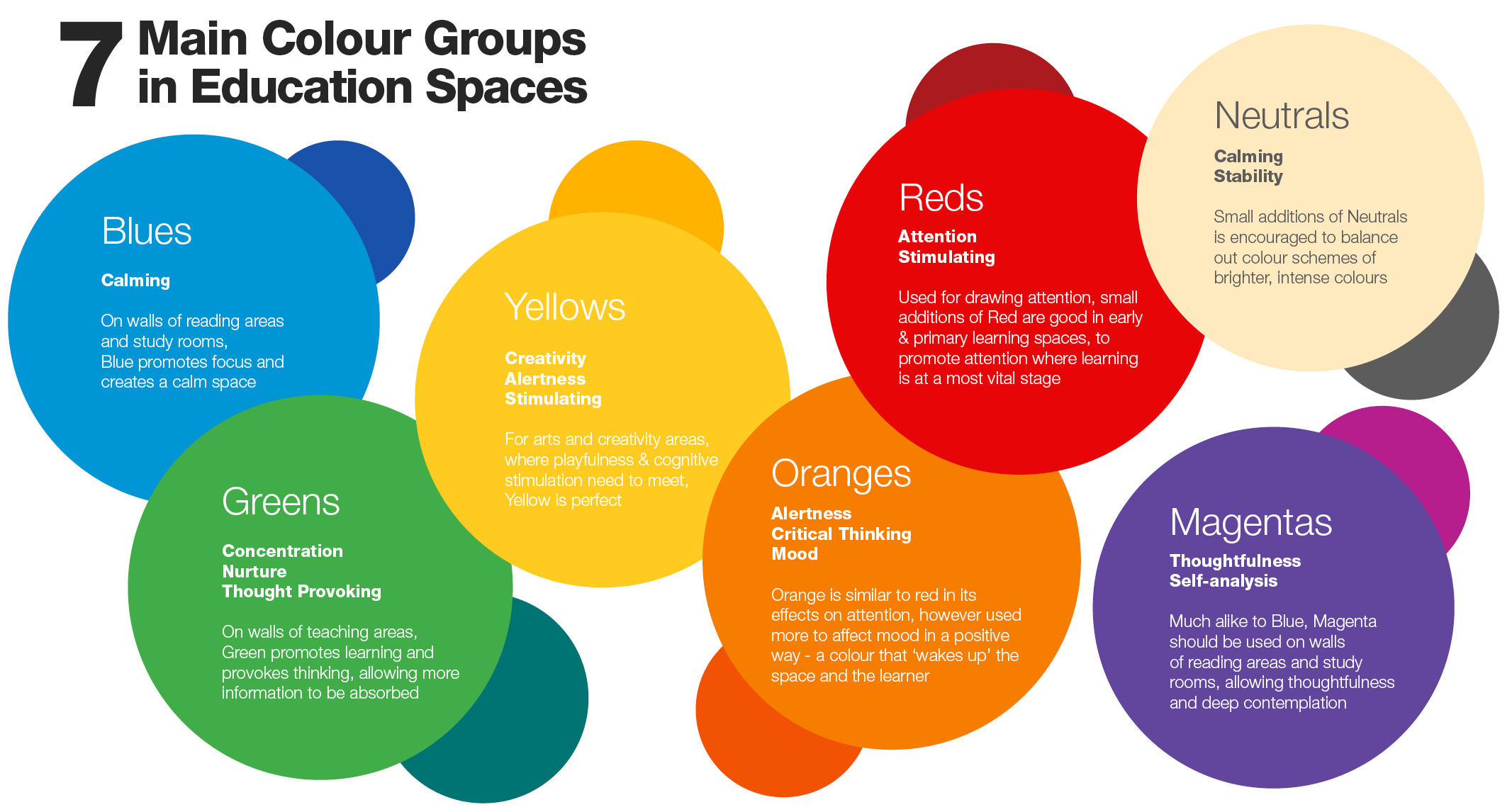
Warm and bright hues, such as yellow, orange and reds complement the nature of children. However, these bright colours are best used as accents, rather than in full. Too man bright colours can overwhelm the cognitive function of young children, causing distraction. Addition of bright colour accents, complemented with neutrals creates just enough stimulation and attention in an efficient learning space.
Kindergarten – Primary School
Similar to Early Learners, Primary Students prefer bright colours. In Primary level years, there is a heavier focus on separating privacy and collaborative learning styles. More private learning spaces need to encourage thoughtful and critical thinking; incorporating cool hues of Blue, Green and Beige. While open, collaborative areas need to incorporate warm hues such as Yellow, Magenta and Oranges, to encourage activity, creativity and movement.
Late Primary – High School
As students move into late Primary learning into High school, and further onto advanced education, there becomes a growing appreciation for more sophisticated and calming spaces to encourage contemplation, concentration and cognitive nurturing. Large uses of subdued Blues and Greens, with accents of deep Magentas is helpful in promoting this. These hues should be complemented by Neutrals, such as Grey and beige, to create a balanced learning space.
Whilst considering age and the affects of colour, placement also plays a crucial role in different learning spaces…
Placement Has Purpose

Every colour should have purpose for its intended space. Colours can make a major impact in every room. The following suggests colour placement for common areas in a school environment.
|
School Office
|
Green, Blue, Beige & Patterns
|
Creates welcoming & nurturing space, encourages social interaction & connection
|
|
Hallways
|
Bright Colours & Contrast
|
Creates interest and life in a confined space, adding accents ever few metres can create a ‘journey’ while walking through a hall or corridor
|
|
Library/
Study Hall
|
Earth Tones & Deeper Colours
|
Study areas engender equilibrium, balance, and stillness and should be quiet in design and allow for concentration. Cool & Natural colours encourage concentration by lowering heart and respiration rates
|
|
Art/Music
|
Green, Magenta, Yellow
|
Encourages creativity
|
|
Gymnasium
|
Bright Colours & Contrast
|
Atmosphere of vitality, will help children feel welcome and encourage activity
|
|
Counsellor/Nurse Office
|
Subdued Greens, Blues & Beige Neutrals
|
Convey harmony and a feeling of warmth and confidence, the best choices are quiet, comfortable colours
|
Traditional vs Modern
Traditional Classroom Setting
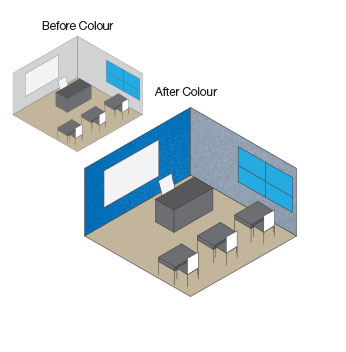
- Focus colour towards the forward-facing direction to draw attention to the teacher
- Work with simple block colours in small spaces to reduce distraction & create focus
|
Modern Classroom Setting
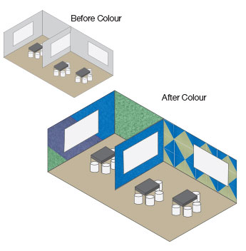
- Open layout requires design diversity for different learning styles; collaborative & isolated
- Work with simple block colours in spaces of concentrated, individual learning to reduce distraction
- Work with a mixture of block colour and complex design to create stimulation in collaborative spaces
|
 |
 |
references:


Designer Pinboards Australia has directly referenced and/or paraphrased the following sources, and does not own the sourced information.

Source: Kansas State University Libraries - New Prairie Press - Adult Education Research Conference 2018 Conference Proceedings (Victoria, BC Canada) - Chang, Bo; Xu, Renmei; and Watt, Tiffany (2018). “The Impact of Colors on Learning,” Adult Education Research Conference.
https://newprairiepress.org/aerc/2018/papers/30 - The Impact of Colors on Learning

Source: “Functional Color and Design in Education Environments.” Architectural Record, August 2014, continuingeducation.bnpmedia.com/article_print.php?C=1107&L=5


